The Mathematical Model of Me project was about graphing; specifically, plotting coordinate points in a cartesian plane. We were meant to learn about graphing in this project, but we also were meant to create the final product in such a way that it should tell viewers about who we are. Thus, the image that we graphed needed to be something that was meaningful to us personally. An image such as the one created is called a mathematical model, or an image made up of multiple polylines. (The name polyline literally means multiple lines; it is a shape formed of more than two line segments.) The more polylines that are graphed, the more detailed the mathematical model can be.
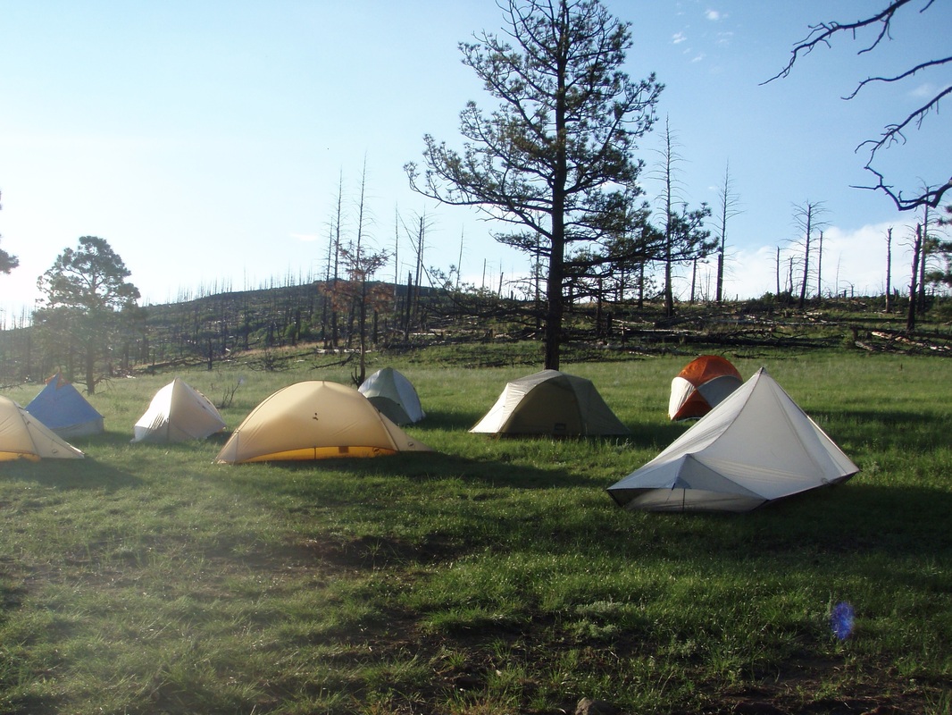
The first step was to find an image that strongly represented us. My face would have been the obvious choice, but for this reason few people chose it. Pets or hobbies were some of the more common selections for my class; I was among the people drawn more toward the hobbies. My image, shown below, was of my crew backpacking at Philmont Scout Ranch. This backpacking trip was the best experience of my life so far; unless I go back, it will probably never be equaled in terms of fond memories and meaningful experiences. I chose this image because the tents are very symbolic of backpacking and because it didn't show any faces in it. I don't know what the rules are in terms of showing other people in a picture without their permission, so I opted not to use anything with my crew in it. Once I selected my picture (shown below) for my first benchmark, I drew line segments in sharpie that went over the outlines of the tents, trees, and background. These line segments would later be used for tracing onto a piece of graph paper.
The first step was to find an image that strongly represented us. My face would have been the obvious choice, but for this reason few people chose it. Pets or hobbies were some of the more common selections for my class; I was among the people drawn more toward the hobbies. My image, shown below, was of my crew backpacking at Philmont Scout Ranch. This backpacking trip was the best experience of my life so far; unless I go back, it will probably never be equaled in terms of fond memories and meaningful experiences. I chose this image because the tents are very symbolic of backpacking and because it didn't show any faces in it. I don't know what the rules are in terms of showing other people in a picture without their permission, so I opted not to use anything with my crew in it. Once I selected my picture (shown below) for my first benchmark, I drew line segments in sharpie that went over the outlines of the tents, trees, and background. These line segments would later be used for tracing onto a piece of graph paper.
Once I traced the line segments onto a piece of graph paper, the next step was to draw two additional lines on the image. One was vertical and one horizontal, and they intersected in the center of the image. The two lines formed the axes of a cartesian plane, or a coordinate place with four quadrants. This was my second benchmark. These would be placed in a spreadsheet in a graphing software called Geogebra, and automatically graphed to form the image.
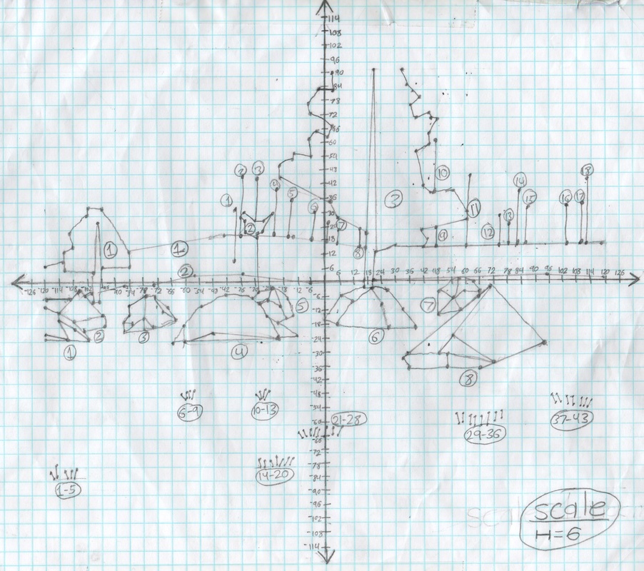
After getting my second benchmark checked off, I found the endpoints of each line segment in the image. These became coordinate pairs. I separated the coordinate pairs into sections, which would be connected in order by line segments. These would form polylines. I then began to input the coordinate pairs to a spreadsheet in a graphing software called Geogebra (the name is a slur of geometry and algebra), but quickly found that I had made my second benchmark much too detailed. To save time, and because I was going to use it in a creative piece at the end of the project anyway, I decided to leave out the line segments that formed the grass and dead trees in the background. Once a group of coordinate pairs was in the spreadsheet, I could highlight the group and then click on a "create polyline" button. This button automatically graphed the coordinate pairs on a cartesian plane - the "graphics view" - and then played Dot-to-Dot with them. Once all of the groups of coordinate pairs were placed in the spreadsheet, I exported it as a .png file, and I had my final image (below). For this image, which was my third benchmark, I opted to hide the points and axes, and only show the line segments.

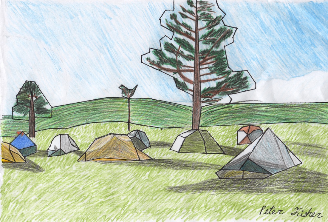
Finally, we printed out the final graphed image and made it into a creative piece: our fourth benchmark. This could involve anything from coloring the image in to putting it on canvas to making a 3D piece to recreating the line segments with yarn! I opted to color in the image with colored pencil, to give it a rough, sketched look, which I think gives the image texture. I referenced the original image to determine what colors went where.
 RSS Feed
