Power, Privilege, and the Pur$e Project
Description
I spent approximately the first third of the school year working on this project in both my humanities and math classes. Each class's work was related to the other, but they were largely independent. We started off the project in both classes with a field trip to downtown San Diego, where we walked around, made observations of the various neighborhoods, and contrasted the affluences of the different areas. After that, we spent the next few weeks in humanities learning about various incidences and periods in history that demonstrate racial discrepancies in socioeconomic status or general racial prejudice, as well as statistics showing those same things now. We read multiple articles on the American Dream and racial bias in our society, and had a few class discussions on these topics. Eventually, we were split into our exhibition roles, which included event planners and fundraisers, statisticians and graphic analysts, performers, and panelists and moderators who led the panel discussions in about our various topics. The entire project was centered around these panels. I was chosen to be a panelist for the Criminal Justice group, and I spent the next several weeks researching courtroom bias, particularly juror bias and the prejudiced use of peremptory challenges. As our main final products, we wrote position papers about our topics, answering the essential question of whether the American Dream is still alive today. Meanwhile, in math, we looked at personal finance, particularly investments and loans, to see the various applications of exponential functions. At the end of this unit, we created personal financial plans, looking at our plans for college, a career, future investments, and even retirement. Once this topic was exhausted, we turned to statistics, and began learning about various types of statistical studies (e.g. observational studies and randomized experiments) and methods of analyzing and presenting data. We learned about such graphing methods as histograms, box-and-whisker plots, scatterplots, and dot plots, and only briefly touched on bar graphs and pie charts as everyone in the class was already familiar with them. We learned how to calculate the correlation coefficient between two data sets, the standard deviation of a data set, and the z-score of a datum. Our main final products in math class were our individual infographics, displaying statistics about our respective topics that highlighted our research in some way. Finally, for our exhibition, we put on a seminar at the Vista Community Clinic with eight panel discussions (four at a time) inside, and a courtyard outside with refreshments, performances, and interactive displays put on by the statisticians and graphic analysts.
Process (Humanities)
Our individual work didn't really begin in humanities until a few weeks into the project, when we were given our roles. It wasn't until this point that we learned exactly which topics we were supposed to research for our position papers and what we were supposed to prepare for the exhibition. Although the panelists were some of the most important participants in exhibition night, as they led the panel discussions that were supposed to be the highlights of the seminar, I actually think that as a panelist I had one of the easier jobs. The roles of the statisticians and graphic analysts were not clearly defined at first, and they had to work to figure out what they were supposed to prepare. The performers had a little more to prepare than I did, and I would have had a really hard time trying to create a spoken word poem, play, or TED Talk, as the first two especially are not my strong suits at all. I really admire every one of the event organizers; they had by far the hardest job, trying to work together across classes to plan a big community-wide, off-campus, professional event. They pulled it off magnificently, I must say. I did not need to do that; I simply had to prepare an opening statement and some talking points for my panel discussion. First, though, I began research on my position paper, for which I decided to talk about courtroom bias, since everyone else in my panel group was focusing on police bias. Over the course of the weeks leading up to exhibition, I set out to make myself an expert - as much as one would expect a teenager to be - on the use of peremptory challenges in the courtroom, and on juror bias. Since it's hard to find statistics for either, most of my research was done through reading about studies, both observational and experimental. Although I have no personal connection to the topic of bias in the American justice system, by the end of the project I had become quite interested in it, just by reading about the various ways in which bias implements itself and the singularly ineffectual ways in which it has been addressed. I wrote my entire position paper in one long weekend. My rough draft was 20 pages; I eventually managed to cut it down to 13 pages. After that, I worked on creating my opening statement, which was essentially a paraphrased version of my position paper, able to be spoken in about four minutes.
Process (Math)
As I mentioned before, we started off with a part of the project on personal finance. This involved many formulas, so we learned most of those before delving into the actual project work. These formulas were used, for example, to find the total amount of money earned from interest in an investment after some number of years or the total amount of money paid with interest over the course of a loan, or to find the down payment for a loan given the loan amount, interest rate, and duration. Once we had all of these formulas, we began to work on the project. The only confusing part for me was that I didn't realize at the time that I was working on my final product for this part. We had a series of assignments to complete, including planning out our college finances and our retirement finances, monthly budget with our planned career, and our taxes, among other assignments. At the end of the first part of the project, before we transitioned to statistics, we took all of these assignments and bundled them up into big packets. Apparently, these were our final products.
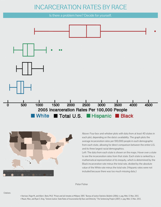
Once we started on statistics, we again worked first on learning before moving into project work. We had a series of assignments to complete using various formulas that we learned in class, including the correlation coefficient, standard deviation, and z-score formulas. We spent a few weeks on these formulas and other important concepts in order to gain familiarity with them. This time, the final product was more obvious: we created infographics relating to our humanities topics which displayed some statistic(s) that were striking in some way. I had a very hard time looking for general statistics on juror and attorney bias. I had already tried for my position paper, in fact, and failed miserably. So, I made my infographic, shown at the very top of this page, on general statistics on incarceration rates by race. I thought it turned out well, even though I used nearly none of the formulas that we learned in class. (I didn't need them.) I had already seen statistics for percentages of the entire prison population broken down by race, but I hadn't yet seen statistics for percentages of the whole population in prison broken down by race. This second one, which I displayed in my infographic, is much more striking. It's actually scary to see. I think that my favorite part of my infographic, though, is the fact that it isn't too wordy. I tried to cut down on the writing as much as possible; the only reason I included the explanation of how the infographic works was to fill space. Instead of drawing conclusions for the readers, I lead the readers into drawing conclusions for themselves, which I believe makes a larger impression.
Once we started on statistics, we again worked first on learning before moving into project work. We had a series of assignments to complete using various formulas that we learned in class, including the correlation coefficient, standard deviation, and z-score formulas. We spent a few weeks on these formulas and other important concepts in order to gain familiarity with them. This time, the final product was more obvious: we created infographics relating to our humanities topics which displayed some statistic(s) that were striking in some way. I had a very hard time looking for general statistics on juror and attorney bias. I had already tried for my position paper, in fact, and failed miserably. So, I made my infographic, shown at the very top of this page, on general statistics on incarceration rates by race. I thought it turned out well, even though I used nearly none of the formulas that we learned in class. (I didn't need them.) I had already seen statistics for percentages of the entire prison population broken down by race, but I hadn't yet seen statistics for percentages of the whole population in prison broken down by race. This second one, which I displayed in my infographic, is much more striking. It's actually scary to see. I think that my favorite part of my infographic, though, is the fact that it isn't too wordy. I tried to cut down on the writing as much as possible; the only reason I included the explanation of how the infographic works was to fill space. Instead of drawing conclusions for the readers, I lead the readers into drawing conclusions for themselves, which I believe makes a larger impression.
Learning (Humanities)
Most of my quantifiable learning came from my research of courtroom processes, such as peremptory challenges and voir dires. Before I started this project, I knew next to nothing about how the courtroom worked, so to be able to intelligently discuss the courtroom now is a fair learning achievement, I think. As far as my learning with regards to the essential questions of the project is concerned, while my knowledge of the various hardships impeding the American Dream has evolved considerably, my opinions haven't changed too much. Before this project, my general thought was that, while racial prejudices and socioeconomic discrepancies certainly make life difficult for certain people, the American Dream is very much alive. Now, after this project, I am able to articulate my thoughts much more precisely. The dictionary definition of the American Dream makes today's reality seem bleak, but I don't believe that it fully does the Dream justice, because the Dream is different for everyone. I've heard multiple versions of the Dream, but they all seem to have one thing in common: they all involve doing something in America that would be harder to do elsewhere. From all the research I've done over the course of this project, it seems to me that America is still a great place to live, and that it is still, in almost every case, easier to do the things one really wants to do here than in many other places around the world. The flood of migrant workers coming to America every day, despite the numerous obstacles placed in their paths, is testament to that. I recall watching a Morgan Spurlock documentary in class about the hardships faced by guest workers in the U.S., and one fact in that movie - the workers could earn a month's worth of Mexican wages in one week picking fruit - struck me just as much as all of the statistics about workers earning far below minimum wage. Even though they face a hard job and are earning what the more fortunate consider to be abominable wages, they are earning far more than they would be otherwise, and are thus living their versions of the American Dream.
Learning (Math)
I was already intimately familiar with exponential functions going into this project, but the formulas that we used, such as the compounding interest or loan down payment formulas, were interesting to play with. I had never tried to do my taxes before, and it was neat to see and understand the bucket system that is instituted in both state and federal taxes, and to model it using a piecewise function. I probably should have been familiar with logarithms by the time I started 11th grade, but in all honesty I had only a basic understanding of them, and I definitely think I learned a lot in the week or so that we spent on the properties of logarithms. I learned how the properties of exponents relate to the properties of logarithms - actually, they help me remember the properties of logarithms - and I was even able to use them on my own to algebraically prove many of the properties of logarithms. I also loved our unit on statistics, since I had never done anything regarding statistics before, and it was fun to learn new formulas and new methods of analyzing data. This unit corresponded well with what I was doing in humanities at the time, since much of my research was done by reading studies and social experiments on juror and attorney bias. I learned how to create a 5-number summary and use this to form a box plot, and I put this to good use in my infographic. I also learned about the statistical problem-solving process, and used it to create my final product: I asked a question of interest – namely, whether the criminal justice system is actually unfair to certain races; I designed and implemented a plan to collect data – I looked at multiple sources, including the Sentencing Project and FBI databases, to gather incarceration rates in 2005; and I analyzed data using box-and-whisker plots and a little formula that I devised to roughly measure the discrepancies in incarceration rates, in which I divided the difference between a state's Black incarceration rate and its overall incarceration rate by the difference between its White incarceration rate and its overall incarceration rate. I interpreted the data for myself, but left my own interpretations out of the infographic, as I hoped to have readers come to their own conclusions. All of my statistical learning actually culminated in my infographic, as when creating it I was able to see for the first time exactly what the racial discrepancies in incarceration rates across the U.S. are.
"Mind the Gap" Exhibition
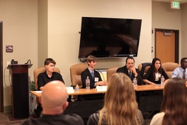 Photo Credit: Dr. Cochran
I must say, I loved my exhibition role. I thought it was fun to sit in front of an audience and participate in a discussion with other panel members, including an actual defense attorney, and then to engage with the audience in responding to questions. I think I had one of the best roles in the project. My biggest challenge was trying to fit my opening statement into the time limit. The main trouble was that I was trying to cram too much information into my opening statement, because I knew I wouldn't have the chance to talk about my research again. This wasn't so much of a challenge as it was unfortunate, but while I researched courtroom bias, everyone else on my panel researched police bias, including the two moderators. Our entire discussion, including the vast majority of the audience questions, were geared specifically towards the topic of police bias, and away from what I actually researched. Only one audience member (my mom) asked questions about courtroom bias, and I wasn't even able to respond because our guest panelist was very outspoken (which I do not resent, as he brought a lot to the conversation and could answer her questions from experience rather than just online research). I was able to participate well enough in the discussion, but I felt a bit like a fish out of water, unfortunately. All things considered, though, it was a fun evening. Having our guest panelist in the room, contributing to the conversation, was one of my favorite parts of the panel, as after researching the ways in which bias plays into juror selection and subsequent juror bias, I was able to hear his take on courtroom bias and the ways in which he deals with the problems I researched.
