The images in the slides above are of my designs for the Vans Shoes contest, in which a school submits one pair of Vans shoes, each of a different style, decorated to fit each of four themes. These themes are, in order that they appear on my designs above, local flavor, art, action sports, and music. I have one slide per shoe; each slide shows the left and right sides of the shoe. At HTHNC, any student who wishes to participate can submit as many designs as he/she likes, and the school will select one for each shoe type and theme. This was also made into a project for the 10th grade art class. The grand prize for this contest is $50,000 for the winning school's art class, and the production of the chosen shoes during the subsequent year, but there are other monetary prizes as well. I decided to design my shoes in Photoshop, as I find it much easier to get my ideas out when I've found and edited images than when I have to draw them by hand based on what I can picture in my mind.
My first local flavor shoe depicts some of the more inland areas of San Diego County, particularly the Poway and Ramona areas, since I live in Poway. It also includes the sign from the San Diego Zoo, since that is a world-renowned landmark of San Diego. The airplanes are small features added to give the impression of a tourist destination. My second local flavor design is placed at the beach, naturally, and focuses more on downtown San Diego, and a little bit of its history, with the Kumeyaay Ewaa. Two features that are common to both shoes are the Spanish tile on the tongues and the image of Mission San Diego de Alcala, which spans the back of both shoes.
For my art shoes, I focused on a famous French painting, consisting of a pipe on a char truce background, with the words "Ceci n'est pas une pipe," or "This is not a pipe" in English, underneath. The idea of this painting is that it is simply an image of a pipe, not an actual pipe. I adapted this caption to read "Ceci n'est pas une chaussure," or "This is not a shoe." These bubble letters are filled in with snippets of other famous paintings: Starry Night and Melting Time. Written across the top of the shoe in a large paint splatter is "C'est L'art," or "It is art." The first shoe is in English and the second is in French. Both have the paint splatters with paintbrushes nearby, but I varied the paint color, as I did with the background. Both shoes have large images of the same pipe depicted in the original French painting, to make my message with the shoes more apparent.
My action sports shoes are very similar to one another; the main component of both designs is Astroturf. One shoe depicts a soccer field and one depicts a football field. I chose red for the insides of the shoes because it seems like a good action sports color, and it provides contrast with the green outsides.
Finally, my music shoes are meant to be a pair of headphones; each speaker is on the top of one shoe, and the headband wraps around the back of the shoes. I also included some music notes, and piano keys to fill in negative space. The final color scheme is extremely different from my original color scheme; I changed it based on peer critique, and it definitely has a completely different vibe than it did. You can see my original shoes and peer feedback in the slideshow below in the same order as my final drafts above; my action sports shoes do not have first drafts, as I asked four people about them and the only feedback I received was (paraphrased), "It's good." The final three slides are images of the peer critique I received.
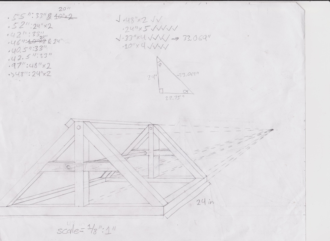
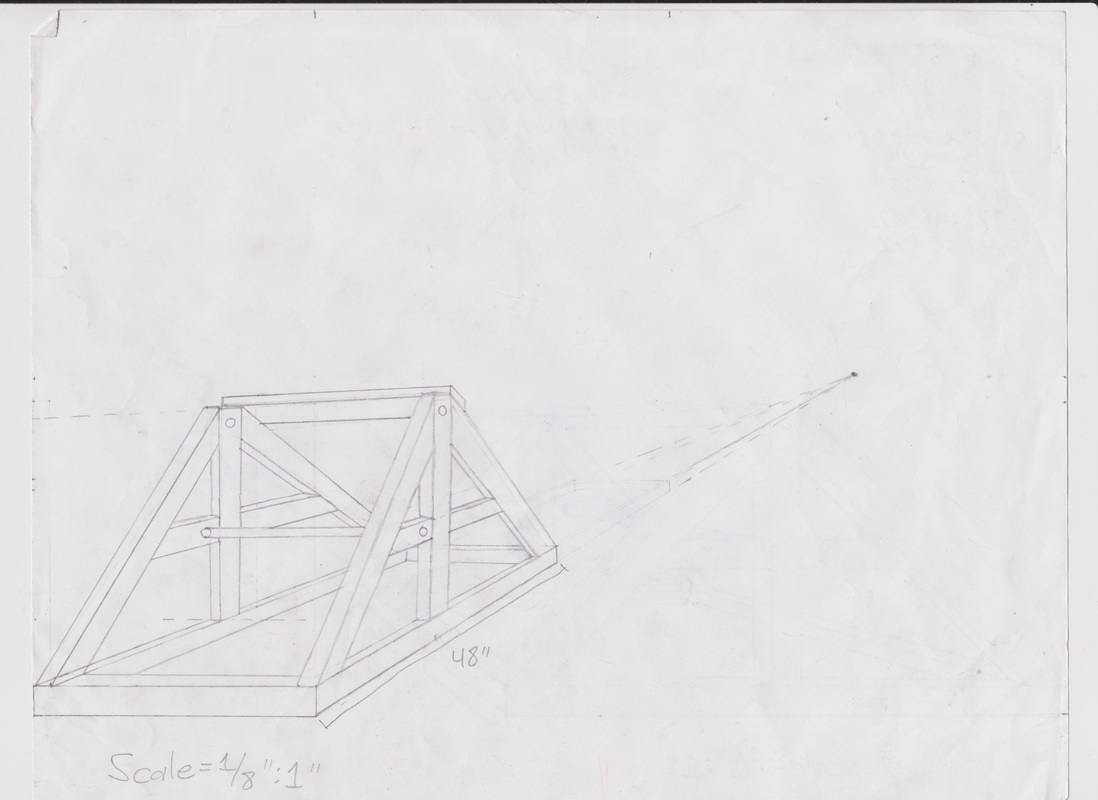
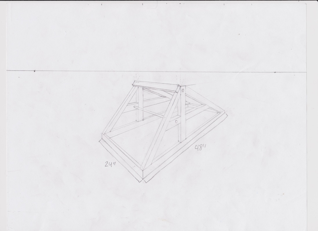
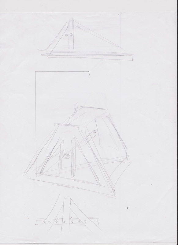
The images above are of my design drawings for the catapult that we have begun to build for a joint Math/Art project, which may include Humanities at some point as well. These drawings were done from different perspectives: the top-left drawing is a single-point perspective view of my catapult concept from the left side, the top-right drawing is a single-point perspective view of my concept from the back, the bottom-left drawing is a two-point perspective view from the front left my concept catapult, and the bottom-right sketches were made when my concept drawings were critiqued by Mr. Sevilla; as a result of that peer critique, the model that my group is basing our catapult off of is my concept, minus the horizontal beams on the back of the catapult, since they're not necessary to its function. The writing on the top of my top-left drawing is two checklists: one of the wood pieces we will need to build the catapult, and another of the wood pieces I brought in. The checkmarks were made as I went, to make sure that we could cut all of the pieces we need out of the boards we had.
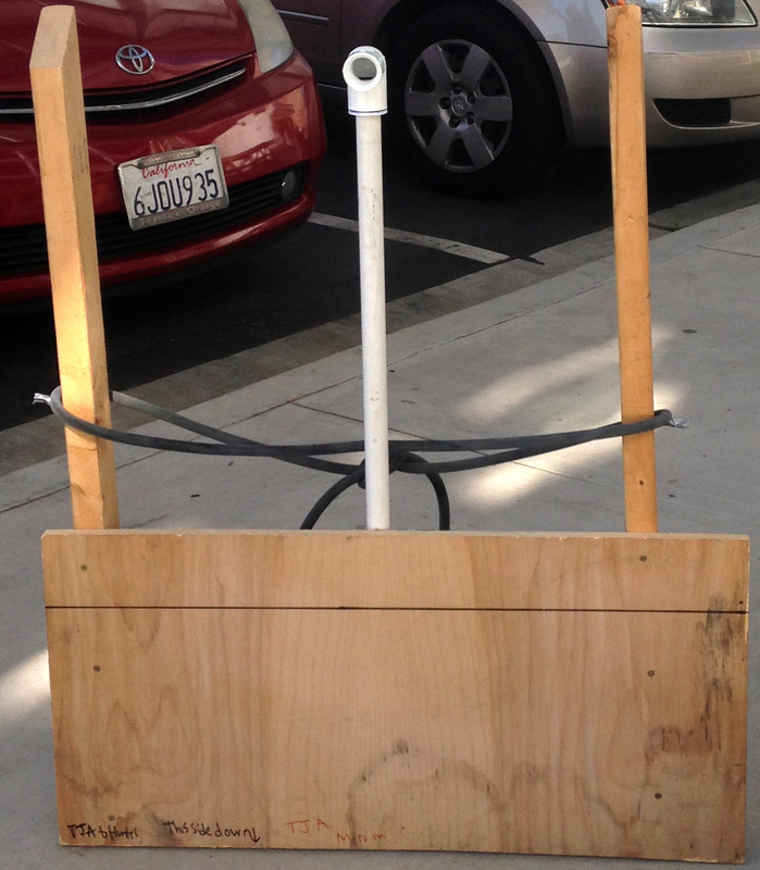
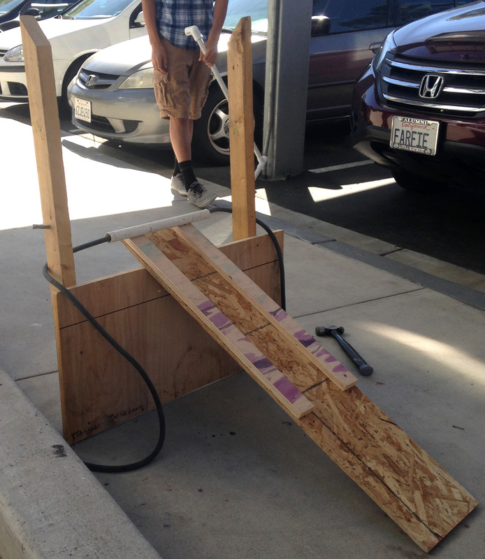
The photographs above are of the two prototypes that my group made for our two different catapult designs: the mangonel (left) and the ballista (right), both powered by latex tubing, one of the strongest elastics commonly available. We built these prototypes with wood from the Art classroom, and PVC pipe that I brought from home that may possibly be used on our final product as well. At the end of our prototyping and testing phase, we decided to go with the mangonel design, as it launched much farther.
 RSS Feed
